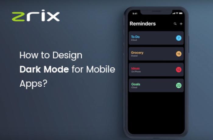

From the last few years, themes like dark mode design trends for mobile applications were under talks. But, last year in 2019, iOS and Android both launched their dark themes. Today, the dark mode UI design trend is widespread worldwide.
These dark mode app themes have their own perks like increasing readability, reducing eye strain, and much more. Today, for every mobile app development company in USA it is now important to keep a dark theme ready for their mobile app development clients.
And many of the companies don’t know how to design a dark theme with the standards of Android and iOS smartphones. That’s why we have this blog post exclusive at our site to help you understand the designing for dark mode in apps.
Remember that the dark ambiance isn’t the result of low brightness. The dark mode design trends must be delightful, readable, and balanced!
Quick Navigation
Why Use Dark Mode In Applications?
We have already come to know that low brightness doesn’t mean dark mode in apps. The colour scheme and design layout that suits our eyes and doesn't give us stress is called a dark mode.
Today, with this blog, you will come to know various tips that help and guide you in designing a dark theme for your app. But, before we tell you the tips, let us tell you the importance of the dark mode UI design for the mobile app:
- Currently, the dark mode design trend is popular and demanding due to its design elements. Hence, these trends are developing day by day as per user requirements.
- When you opt for the Dark mode in the mobile application, the battery life increases because the consumption is less.
- The dark mode works well when the mobile screen is OLED!
- With respect to health & wellness, the dark mode stops featuring the brightness; thus, protecting your eyes. It means your eyes relax more when the app is in dark mode. The dark mode app benefits the health and wellness of your eyes.
Fault Designing for Dark Mode Impacts Your Health!
When you're analyzing a white textual content at the black background, it creates stress on iris because it opens up more light, and the deformation of the lens creates a frizzier consciousness to your eyes.
This is referred to as the Fuzzing Effect which is considered one among the largest demanding situations of darkish mode app layout.
If the smartphones denote the bad dark mode to your eyes because of excessive assessment, then they can pressure them very fast.
For instance, in case you use your pc withinside the maximum darkness, you realize how painful it's to study the complete textual content.
As stated earlier, the dark mode enables to extend battery life. So, it simply influences the gadgets providing the OLED screen.
When customers are uncovered to this impact, they experience exhaustion via way of virtual experience. This is why the right designing of the darkish mode is required.
Let’s head directly to the subsequent segment of this blog!
How to design a dark theme for the Android app?
In 2019 at Google I/O conference came up withy extensive documents support to help designers in understanding and implementing the dark mode ecosystem in Android.
The tech giant or the world’s best company to work in, established various principles to define the dark mode app Android version:
To design a dark theme, use the grey shade in place of strong black to display app layout with an extensive intensity. Use fewer colors in the dark theme UIs, so the bulk of the area is devoted to dark surfaces.
When designing the dark mode in merchandise requires efficiency, it includes gadgets with OLED screens, preserves battery lifestyles, and lower the usage of pixels.
The dark mode UI doesn’t cause eye strain and increase the legibility. Choosing a color for both light and dark UI themes is good. A light text and a dark background, increase the opacity levels by 80%.
Ordinary dark mode users with low vision increase the accessibility of black and gray shade comparison standards. The dark theme UI layout needs to be sufficiently dark to expose white textual content.
They have to use a comparison of at least 15.8:1 among the textual content. Doing this guarantees that the frame textual content passes the WCAG’s AA widespread of 4.5:5:1 while brought to surfaces at the best elevation.
In the procedure of designing a dark theme matter, the additives preserve the identical default shadow additives and elevation stages. What differs is the illumination of the floor of elevation stages.
The better a layout elevation, the lighter will be the layout. The lightness is proven thru a semi-obvious overlays’ application. Overlays additionally make it feasible to distinguish among the additives and notice the shadows.
States speak the repute of interactive factors in the dark theme layouts or additives via way of means of the usage of the overlays. In a dark theme, states are identical overlay because of the default mild subject matter.
Hire Android apps developers in USA to design good dark modes in your applications!
How to design an app for iOS in dark mode?
With dark mode, Apple too told a different meaning of UX/UI in the style and colors using iOS. We have already looked into the change in the Android version, let’s now look into the changes which Apple brought to help the designers in the designing dark mode in the iOS 13.
For standardizing the appearance and experience of the iOS apps in each dark mode, Apple provides designers with semantic colors for basic UI elements.
These colorings do now no longer include absolute RGB value, they at once adapt to iOS interface and deliver semantic colorings with the textual content and overlay shade mode.
In addition to the semantic colorings, Apple has additionally provided designers with the predefined machine colorings which might be dynamic and supportive to dark mode. This manner those colorings adapt to chose interface patterns just like the semantic colorings.
With iOS 13, Apple has delivered four blur results and eight vibrancy results, which robotically adapts to the iOS interface fashion. Apple has additionally delivered four vibrancy results withinside the iOS darkish mode typography suite, three withinside the overlay, and 1 for the separator.
Wrapping Up
Now you are well-known to the advantages of the available dark mode app for Android and iOS smartphones. It is easy to understand the pros and cons, but very difficult to design dark mode themes!
Either you become a professional UI/UX designer or try to hire iOS app developers in USA whose approach can help you to make the best-designed application giving you a healthy user experience.